User Journey for Using a Wearable Device and
Monitoring app
OVERVIEW
This study was the first of a series we plan in order to design a HQB app. The HQB MVP delivers a biopsychosocial assessment and remote monitoring tool for patients of chronic conditions and health practitioners.
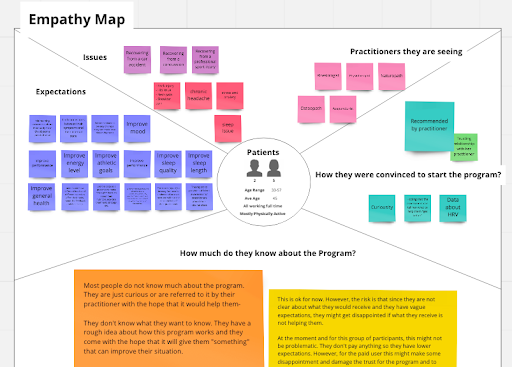
The goal was to have a better understanding of our target users as well as their journey using HQB MVP. Through a series of interviews with both HQB user groups (Patients and Practitioners) over the course of two month usage, diary and concept validation sessions, we gained insights about unmet needs and expectations of our target users prior to using our MVP.
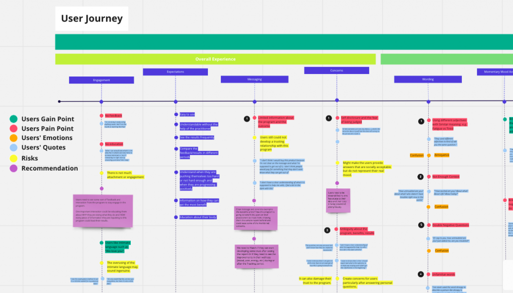
This phase also highlighted the major users’ pain points and things that needed to improve in order to provide better user experience for users and engage them in a long term and continuous usage.
The insights from this study were used to design the HQB apps for both patients and practitioners.
ROLE and Responsibilities
User Research Lead
Design and conduct user research, work with stakeholders to understand their needs, mentor other team members to conduct user research
METHODS
- Field Study
- Interview
- Concept Value Test
- Diary


Background
This project has been done for HealthQb a Vancouver based digital health startup. The HQB Prototype is designed by HealthQb to deliver a biopsychosocial assessment and remote monitoring tool for health practitioners to optimize practitioner-led interventions for the treatment of biopsychosocial conditions.
Users’ biometric and momentary assessment data are collected through a combination of a wearable device and an interactive mobile app platform for three weeks. Based on this data, healthQB provides health recommendations for both patients and practitioners. The usage will then continue for three months of tracking the health changes upon applying the recommendations.
HQB technology was approved and recommended by a few practitioners and health centres in Vancouver, BC to be used by their patients. However, we needed to have a better understanding of the unmet needs of these two groups as well as their experience of using HQB MVP to better design a customized app that can benefit both patients and practitioners.

Problem
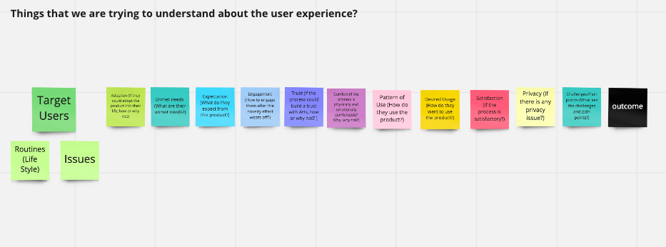
In order to provide a better experience for both user groups (Patients and Practitioners) and design the final application, the team needed a deeper understanding about:
- Users’ pain points of using HQB MVP
- How patients would adopt this platform to their daily life?
- How practitioners would adopt this technology to their practice?
For this phase of the project, based on the stage of the product development, we decided to focus on the following objectives in the discovery phase:
- Understanding the patients’ journey: We aimed to understand the pattern of usage, the benefits that the users would receive and the pain points they would face when using the HQB platform.
- Understanding the practitioners’ first impression: We wanted to practitioners’ first impression and perspectives towards this technology and if it is something that they need or are willing to adopt to their practice.

Process
Patients from healthQb’s user group were asked to use the HQB MVP for the duration of two months. These two months usage consisted of 21 days “basement assessment”, one week “reporting assessment” and one month of “tracking period”. Users’ insights were captured using the following methods:
- Interview: Over the course of MVP usage, I conducted bi-weekly interview over a video call session. In these interviews we aimed to understand their experience using the prototype, whether they could incorporate the prototype into their daily lives and the pain points and challenges they faced in their journey of using this prototype.
- Audio Diary: in order to gather the users’ momentary experience, I asked them to record and share their positive and negative experiences of using the HQB prototype at least a week using an audio application.
- Interview with Practitioners: For each patient in the program, I also interviewed their practitioners regarding their patients’s experience to understand how this application would help practitioners to treat that specific patient.
- Concept Validation: Practitioners were individually introduced to the sample HQB report and were asked questions regarding the effectiveness of such a report as a complementary tool in the process of treatment of patients suffering from chronic pain.
Deliverables


Impact
This phase highlighted the major users’ pain points and things the needed to improve for the app in order to provide better user experience for the patients and engage them in a long term and continuous usage.
It also provided the team better understanding of our target users, their needs and the expectations of such product.